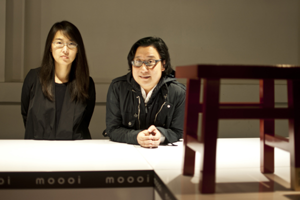

Two years after having designed the Emperor lamp for Moooi, Neri&Hu returns to collaborate on the Common Comrades series of stools. The six stools, each one taking after the personality of a prescribed person, find their roots in Oriental culture and lend themselves to the narrative character of many of Moooi’s projects. Here, we speak to the design duo about the project.
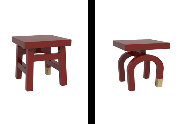
Farmer (L) and Emperor (R)
What are the main ideas behind Common Comrades?
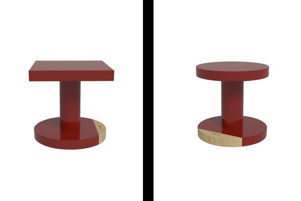
Lyndon Neri (LN): The Comrades came from a very very simple idea, which was to celebrate ordinary people, personalities, and objects that these people use. And in an abstracted way, they represent a personality – whether they actually use these products or not. So if you look at it closely, there are names engraved on the stool. They are for the merchant, the scholar, the seamstress, the tailor, the farmer and emperor.
Rossana Hu (RH): It’s about the personification of these objects, and then finding personalities and characters through each trade and what they do. And the comrade is the idea of the community, people working together, celebrating the everyday.
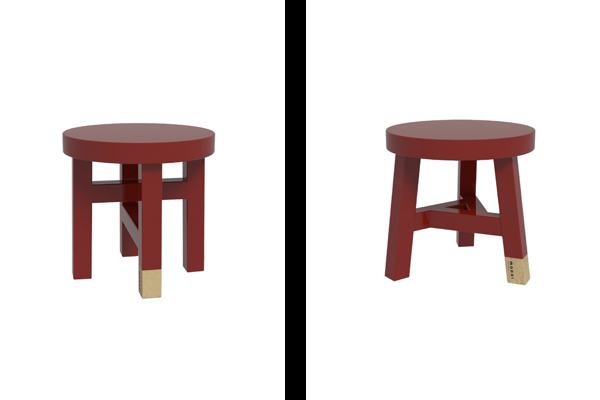
Scholar (L) and Merchant (R)
And the stools reference traditional Chinese furniture making techniques…
LN: It’s interesting because lacquering is a process that was used a long time ago in China. But this particular form is not so old, maybe turn of the century, but it’s a very basic utilitarian form. And to combine a very traditional lacquer on a typology that was during the turn of the century, and to put it in the context of Milan and Europe – there are so many layers that make it interesting. Of course there’s the one typology that you don’t see very often, that’s the Emperor.
RH: It actually came from a historic image that we found, from a chair. From a stool.
LN: But that stool was also sometimes used as a saddle, on a horse. Each stool has its own historical reference.
RH: Some more solid than others. A few had historical references. But of course, the scale, the actual proportion, is reinterpreted to make it more cohesive as a collection.
Is it intentional that you reference Chinese culture in many of your projects?
RH: I think a lot of our design, whether architecture or interior or product design, are inevitably an expression of a lot of the issues that we think about. Identity and culture is definitely one of them, and it’s on top of the list of our whole obsession and passion about design and architecture. Because no matter what you do, we believe that these design products, whether it’s a building or a chair, are kinds of cultural productions. So, in that respect, because of our background, if we draw references, that’s where we draw, because that’s where we are.
The other issue is that we’re very conscious about the brand positioning and the brand architecture of their need and identity and how that identity can be coherent and cohesive with our personal identity as designers. For example, if we want to explore the idea of culture and identity through Moooi, this type of thing, and also the Emperor light, these are much more formal in exploration. There’s a bit of humour, storytelling behind each piece. That’s just what the brand’s about. It’s our interpretation of what Moooi means for us.
LN: Also, the media looks at it and they also see it with a Chinese filter. They see Neri&Hu, immediately they put a Chinese filter. Like if they see Nendo, they want to think Japanese. You can take a Nendo piece and if you say it’s by Marcel Wanders, they’ll probably put a Marcel Wanders hat. But in many ways, we are not necessarily that Chinese.
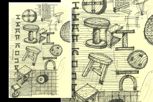
Common Comrade concept sketches by Neri&Hu
What do you mean by that?
LN: What I meant was an abstraction, in that a lot of Chinese designers, or the not so good ones, hold on to traditional craft [apart from context]. When a Ming dynasty chair was designed, it was very contemporary. It was very ‘to that day’. And yet people still continue to take that form and shape and interpret it today, though a lot of issues that were relevant to the Ming dynasty era are no longer relevant today. Hopefully what we are trying to do is to understand the essence of what a Ming chair represents and apply it to contemporary issues and what’s needed today.
Neri&Hu
neriandhu.com