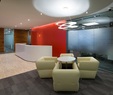
In designing Shell’s 22,000 sq ft office in Hong Kong’s Landmark East building, HBO+EMTB worked closely with a steering committee to identify innovative ways to achieve optimum project savings in the material selection and construction phase.
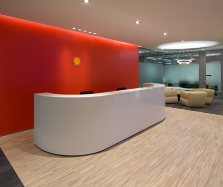
“We had great success in the material selection – ’maintaining without sacrificing’ the design concept and functions. For example, we applied stucco paint instead of limestone for the reception wall finish. It has the same effect as limestone, but we saved on our budget cost – about 40% – and promoted a sustainable product,” says HBO+EMTB’s designer Hazel Wong.
The reduction of the “logo wall boundary” says Wong, also translated into material cost and labour savings whilst effectively highlighting the branding area.

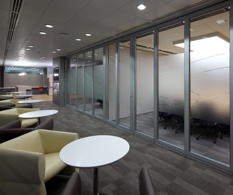
The open office plan also encourages interaction, collaboration and communication.
“For example, the conference rooms are a series of interrelated rooms with the flexibility of allowing seamless reconfiguration to accommodate functions and special events,” says Wong, adding the design also helps “facilitate conversation and ideas across practice boundaries”.

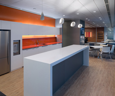
Shell’s corporate colour scheme of reddish orange, bluish purple, turquoise and yellowish green, which represent 5 natural energy sources – Fossil, Sun, Gas, Wind and Water – were thoughtfully integrated throughout the office space.
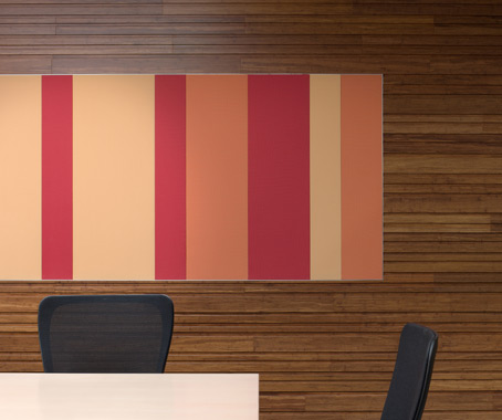
The different colours not give each area a distinct identity, but also reflect the energy of the company’s business.
For example, the front of house uses the neutral colours of Fossil to convey a sense of timelessness and reflects the strength of Shell’s history. In the back office, an open plan with accent colours of blue, purple and green provides a refreshing workspace and encourages communication.
HBO+EMTB
hboemtb.com