The home of architecture and design in the Asia-Pacific
Get the latest design news direct to your inbox!
Get the latest design news direct to your inbox!
If you haven’t already seen ‘Century of Light’, head down to the National Gallery Singapore before 11 March to experience an exhibition space as impactful as the artworks it contains.
March 2nd, 2018
When it comes to the design of art exhibitions, there’s a fine balance between ‘designing the space’ and ‘designing breathing space’ for the artworks on display.
“Over-designing would be detrimental as it sidelines the visitor in the experience of understanding the artworks… Although it’s important for the design to be as ‘invisible’ as possible, it should also add an additional layer to the quality and ambience of the space,” says Farm.
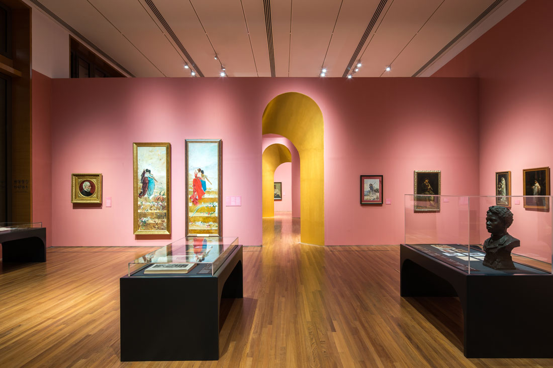
The studio was responsible for shaping the environmental experience of two exhibitions currently on display at the National Gallery Singapore, which are presented under the moniker ‘Century of Light’. The two shows, titled Colours of Impressionism: Masterpieces from the Musée d’Orsay and Between Worlds: Raden Saleh and Juan Luna, focus on the range of painting styles that developed in nineteenth-century Europe during the post-Enlightenment period.
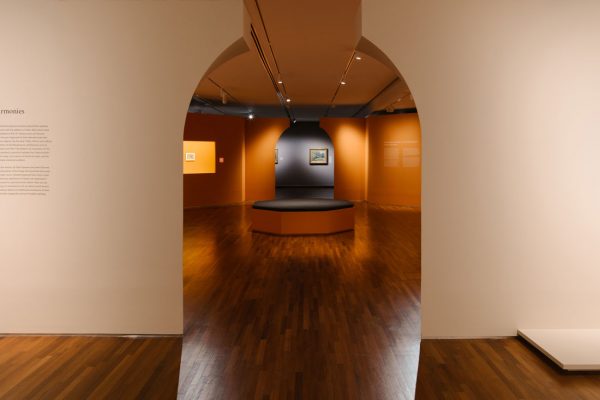
Farm’s exhibition design picks up on the significance of colour and light in the works, and also harks back to the essence of spaces such as the drawing rooms of that era. The designers developed the exhibition spaces as a series of large rooms interlinked by archways and openings that play upon the transition from one space to the next.
The familiar form of the archway became an object for design investigation by the team at Farm, who were keen to subvert its language and expression. The designers played with scale and proportion, exaggerating the height of the archways that link various sections of the galleries and skewing them intentionally to create a sense of unfamiliarity. The idea was to heighten the senses of gallery visitors as they pass beneath the arches and transit between spaces.
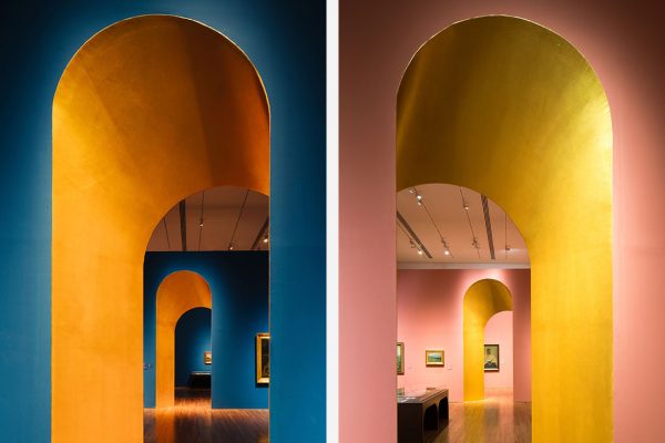
Painted in a luminescent gold, the insides of the archways (which frame key artworks in the adjacent spaces) nod to the gilded gold frames of many of the paintings in the exhibitions. Reflecting light, the archways cast a glow that contrasts with the matte finish of the walls.
Colour is another important component of the exhibition design. The artworks in Colours of Impressionism were curated with distinct colour themes as used by the artists. Farm therefore painted each room with a hue that best corresponded with that section of the exhibition. For Between Worlds, Farm gave each artist a distinct hue: radiant blue for Raden Saleh and dusty pink for Juan Luna. The colours bleed into each other at the point where the exhibition storyline crosses from one artist to the other.
Photography by Studio Periphery.
INDESIGN is on instagram
Follow @indesignlive
A searchable and comprehensive guide for specifying leading products and their suppliers
Keep up to date with the latest and greatest from our industry BFF's!
The internet never sleeps! Here's the stuff you might have missed