The home of architecture and design in the Asia-Pacific
Get the latest design news direct to your inbox!
Get the latest design news direct to your inbox!
Peer behind the calming timber reception and you will be surprised to find bursts of pink, orange and blue. This dermatology clinic breaks with convention to offer a new way of projecting professionalism and comfort.


How many ways are there to design a clinic? Based on the most prevalent precedents, only one. A neutral-toned and clinical palette is the de facto design strategy for projecting a professional image of medical and care services.
According to Cherin Tan, Creative Director of interior design firm LAANK, it doesn’t have to be this way. “Comfort doesn’t [only have to] mean comfortable waiting chairs. It extends to [considerations of] colour psychology, design touch points, et cetera.” She should know, having designed several clinics with unconventional interiors and receiving good feedback. A new project makes another case in point.
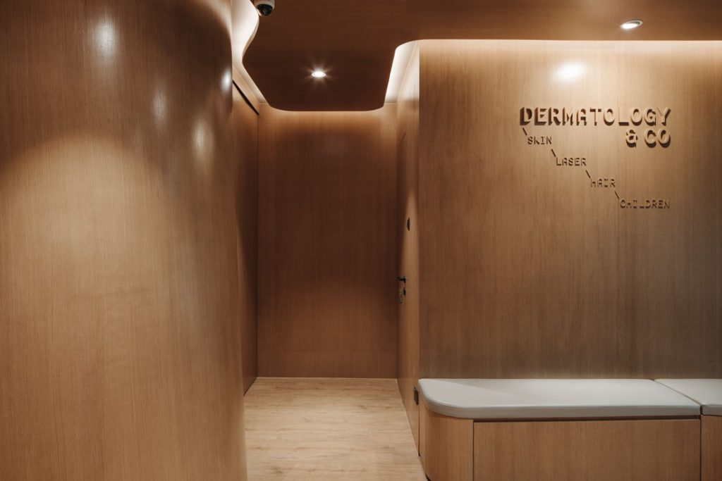
A billowy, timber-clad wall envelops the reception area of Dermatology & Co., weaving upwards and sideways. The timber ceiling’s edge undulates in tandem, detached slightly from the walls for light to wash down, emphasising the expressive surfaces. The flooring is vinyl in a similar, light-brown tone, and shelving, cushioned benches and the reception desk follow the same organic language to blur the boundary between object and space, furniture and structure.

There is a nautical feel to the space, which makes for a cosy welcome and breaks down formality from the onset. The cocooning, nest-like environment offers comfort so customers will feel at ease and confident they are in safe hands, says Tan.
“Guided by [characteristics] synonymous with skin care – softness, sensuality, neutral and subtle tones – this space has natural, textured materials and pits curves against straight lines. The quality of each material is apparent but lives in harmony with each of the others. A sense of balance and serenity is the result,” she adds.
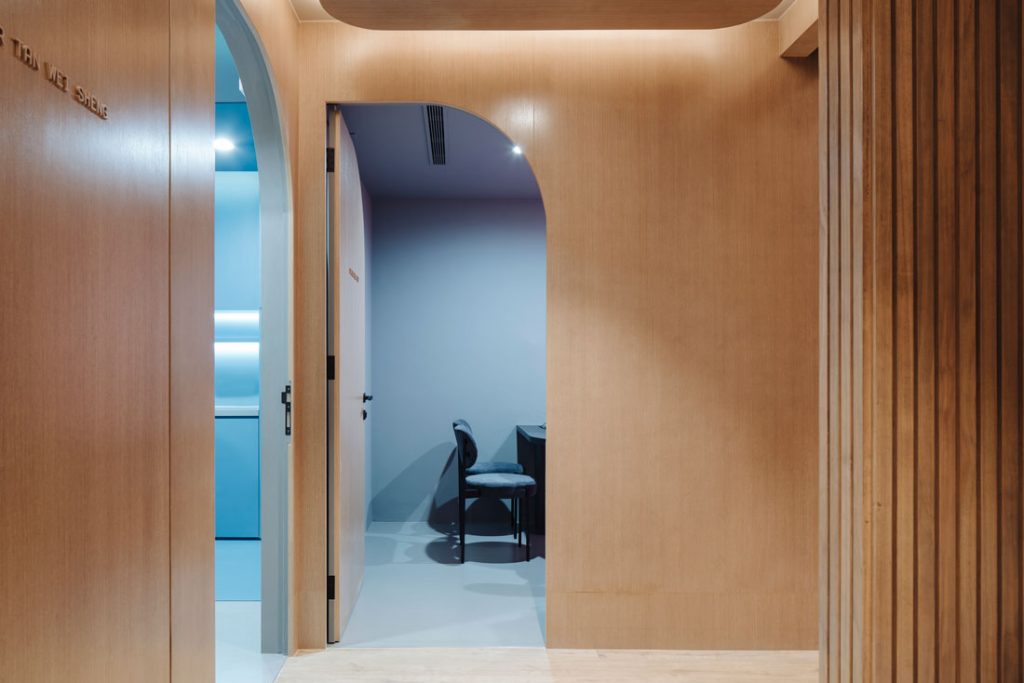
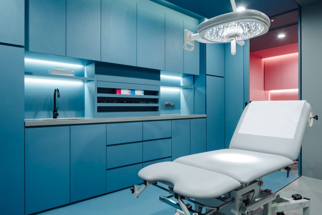
Two consultation rooms nestle deep into the plan, connected to and sandwiching a treatment room. A half-walled private lounge for customers waiting for their anaesthesia (cream) to take effect is positioned between the most public and private zones. “Instead of hoarding them in a closed room, we wanted an open space for them to feel relaxed. Yet it maintains enough privacy while being close to the doctors,” says Tan.
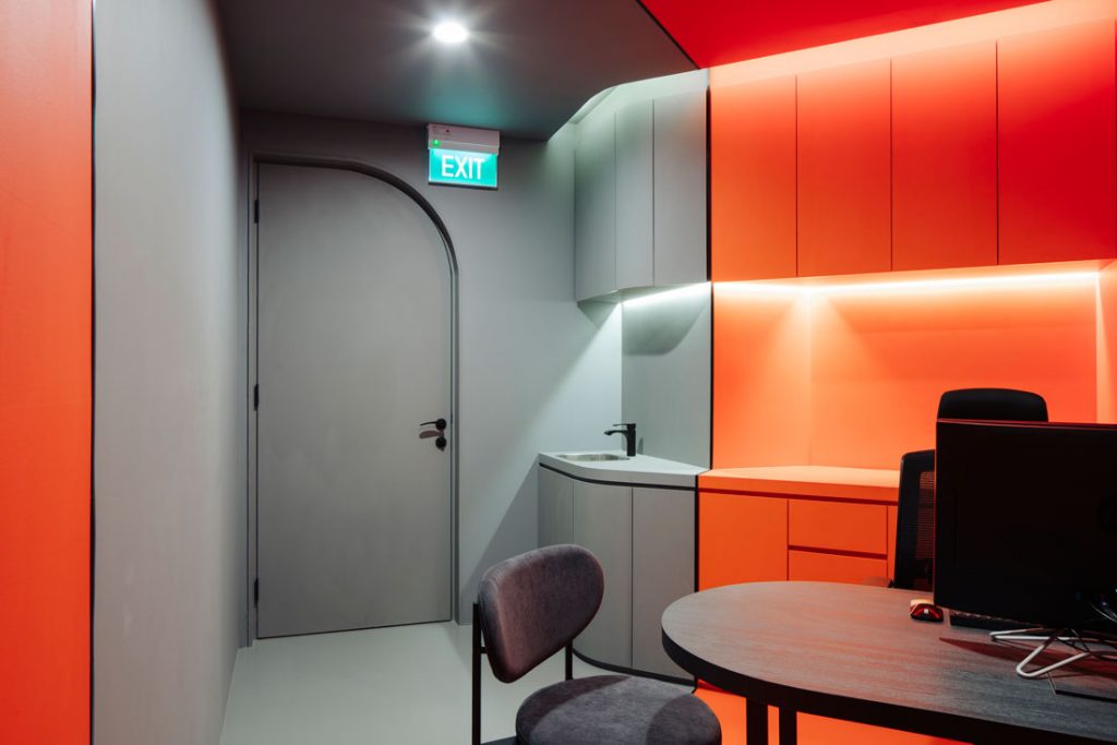
Behind closed doors is another surprise. Tan has wrapped the pantry, toilet, consultation and treatment rooms with saturated pops of colour that extend across floor and ceiling. In each room, a monochromatic shade grounds another punchier colour.
The bold colour blocking creates a memorable experience for customers that is warm and inviting but no less professional, says Tan. For a personal touch, the doctors – who spend a large amount of time in their rooms – were asked to choose their favourite colours. Hence, pink and orange adorn the consultant rooms and blue is a shared colour for the treatment room.
The clinic is big on design but also highly functional: the plan facilitates the flow of procedures as well as customers and staff, and thoughtfully designed carpentry tucks away the many small pieces of equipment and tools. Yet they remain within easy reach. Other features – timber signage on timber surfaces; curved, dual-finished doors to match both interior and exterior; contoured tables in black laminate that echo the graphical, matte-black taps – contribute to a holistic design. Such attention to detail perfectly encapsulates the clinic’s ethos of precision and care.
–
Want more wellness design inspiration? Take a look through our archives.
INDESIGN is on instagram
Follow @indesignlive
A searchable and comprehensive guide for specifying leading products and their suppliers
Keep up to date with the latest and greatest from our industry BFF's!
The internet never sleeps! Here's the stuff you might have missed