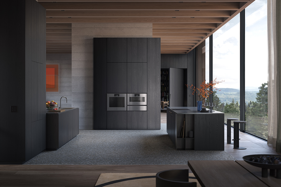
A turn of a dial can tell a surprising amount about an appliance. There is the resistance beneath the fingertips, the sound of its movement and the way a screen responds. For Soeren Strayle, these small encounters are central to how a product communicates its identity. At Gaggenau, where he has shaped interaction and interface design for more than two decades, they form a language of their own.
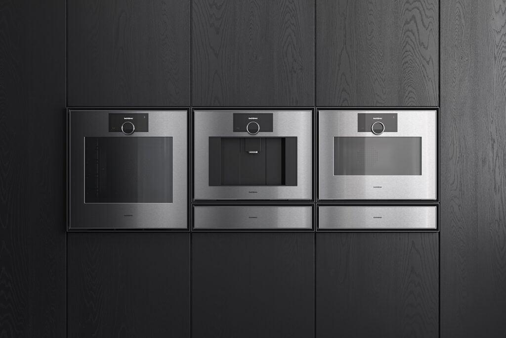
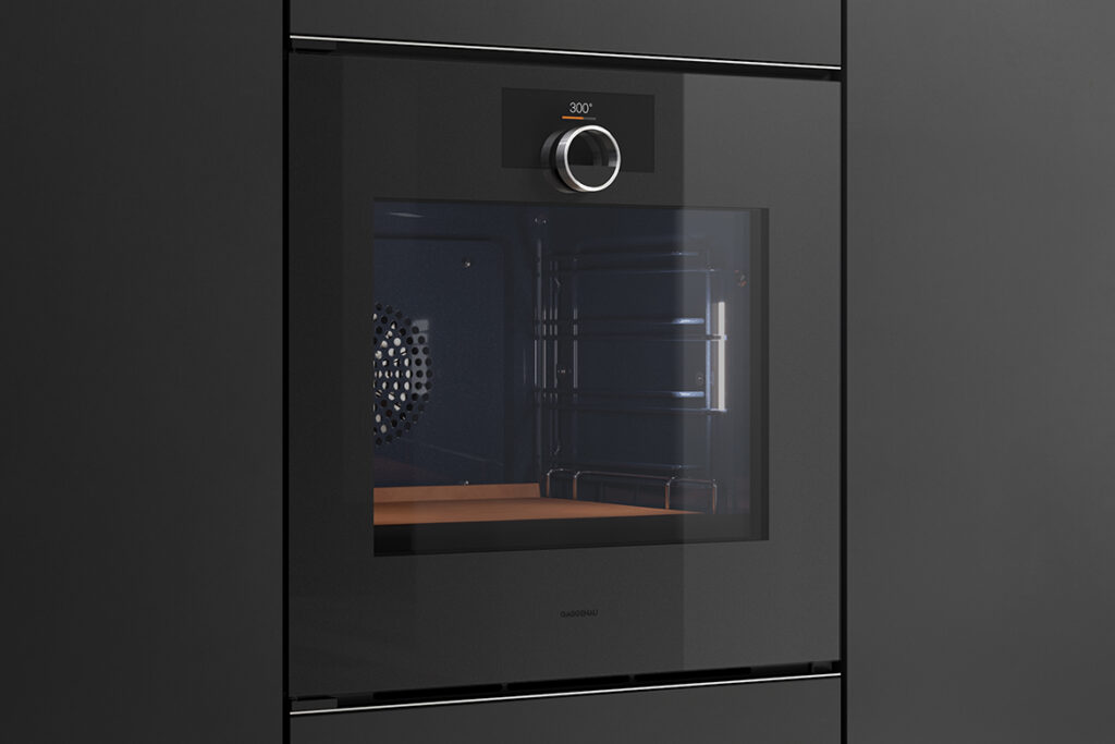
That thinking finds an expression in the floating control ring featured across the brand’s Expressive and Minimalistic series. Appearing to hover over the display, the stainless steel element gives the interface a sculptural centre. Its apparent weightlessness is balanced by the reassuring substance of turning it: a physical gesture that connects the user to the technology behind the glass.
“Early in the development phase, we used provotypes, a term blending provocation and prototype, to test radical ideas on how to evolve our traditional dual-knob layout,” explains Strayle. “When that pivotal breakthrough occurred and we realised the future lay in consolidating everything into a single, central rotary element, everything fell into place. We had cracked the formula to elevate our interaction design and redefine the visual identity of the entire brand. Today, that ring stands as our iconic hallmark.”
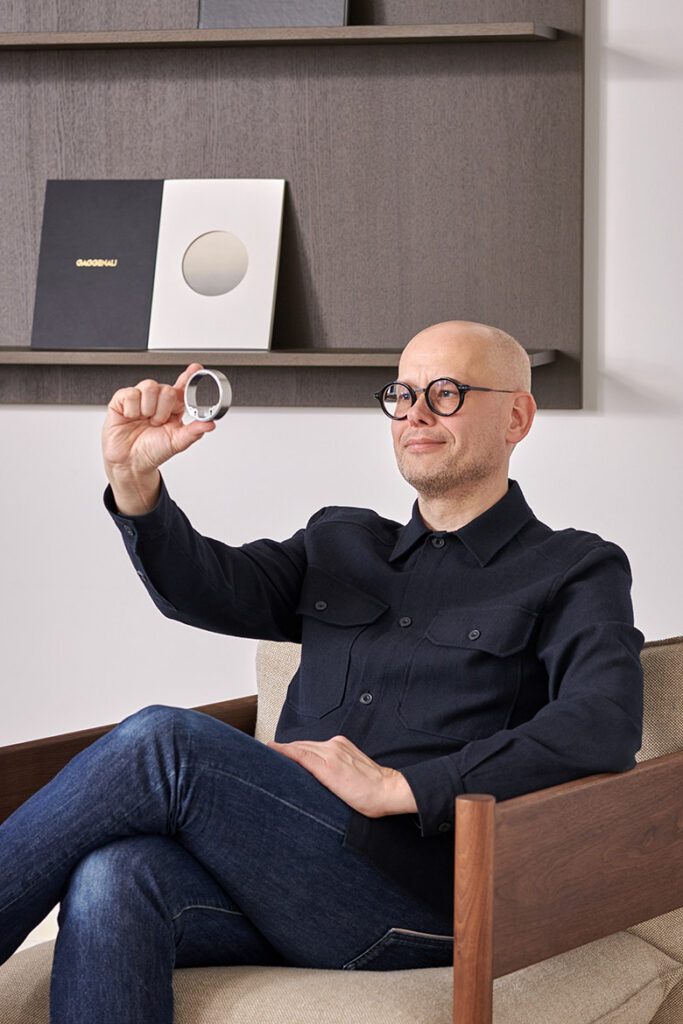
Strayle arrived at design through art, studying at the State Academy of Art and Design Stuttgart. That background continues to inform his attention to context and narrative. An appliance interface, in his view, carries the history and character of its maker through everyday use. For Gaggenau, this means translating a longstanding commitment to craftsmanship into interactions that can remain relevant as digital conventions change.
His approach draws on German and Bauhaus design traditions, with their emphasis on functionality, geometric clarity and considered detail. Yet his interpretation has become less dogmatic over time, making space for an emotional dimension within an otherwise disciplined design language.
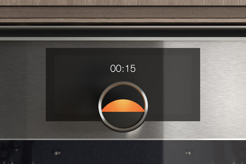
“Without that evolution, something as poetic as the ‘sunrise’ animation would never have seen the light of day,” muses Strayle. “The ‘sunrise’ serves a clear functional purpose as a progress indicator. Yet its execution – a warm orange sphere gradually ascending within the aperture of the ring as the cycle progresses – has an almost playful, emotive character. Visually, the sun quite literally begins to shine. We could easily have presented this through a strictly technical progress bar. But introducing this touch of poetry was vital to me – because great design should also bring quiet moments of joy to daily rituals.”
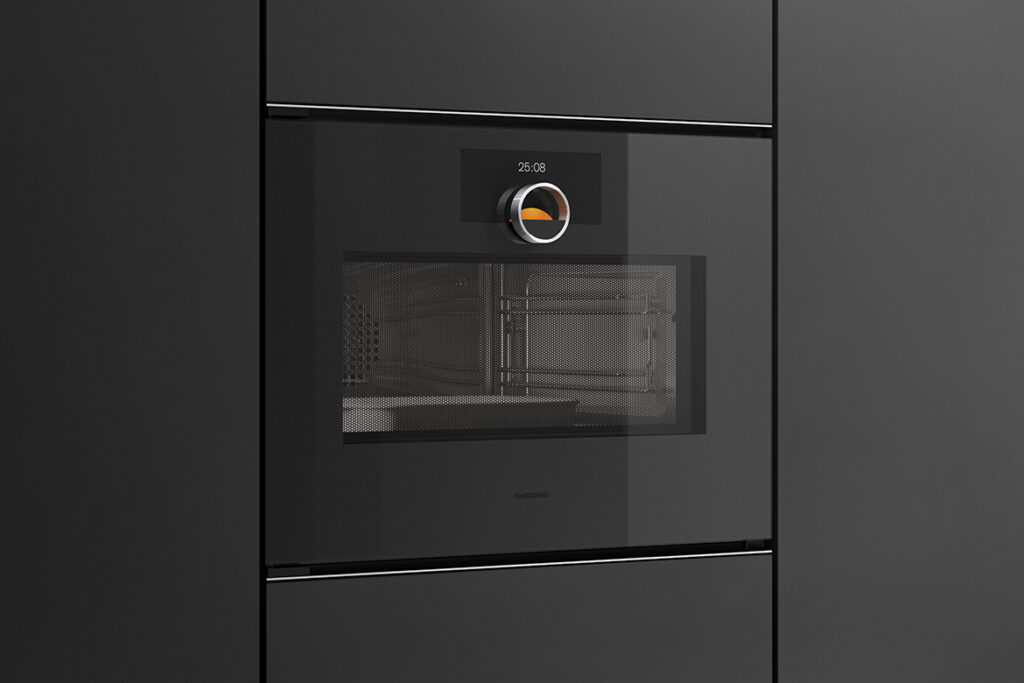
Touch the ring and an animated halo appears behind it, visually connecting metal and display. Turn it and the selected setting at the twelve o’clock position grows subtly in prominence. Tap the temperature on screen and it moves into that same position, indicating that it is ready for adjustment. These restrained movements guide the user through the interface, providing cues without demanding much conscious attention.
For Strayle, the lasting value of this work lies in how naturally it continues to serve people. Culinary habits and preferences for feedback may vary between regions and continents, but direct physical control remains a useful point of connection. Gaggenau’s consistent, symbol-led interface builds on that shared gesture.
Gaggenau
gaggenau-asia.com