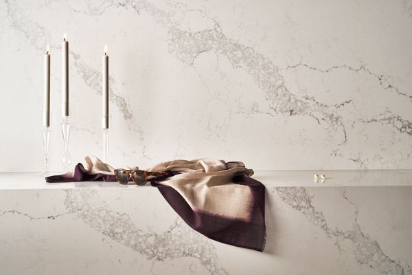
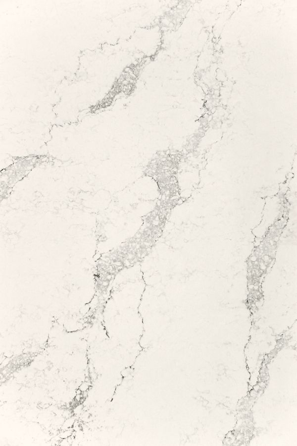
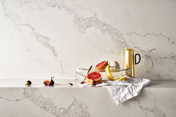
Caesarstone expands its marble-inspired colour ways with Statuario Maximus augmenting the robust Supernatural Ultra collection. Designed to imitate the various nuances in colour and detailing of natural marble, the Statuario Maximus has a soft white base and warm grey veins running across its surface to add dimension and character.
“Over recent years we have seen the market truly embrace the natural inspired marble supernatural designs both in Australia and overseas. The combination of marble design quartz surfaces fuses the timeless marble look with all the superior functional benefits of Caesarstone – scratch, heat and chip resistance” says Andrew Dixon of Caesarstone.
Indeed, the Caesarstone quartz composition has a hardness of seven on the Mohs scale – a higher rating than marble, and therefore having a much longer practical lifespan than marble.
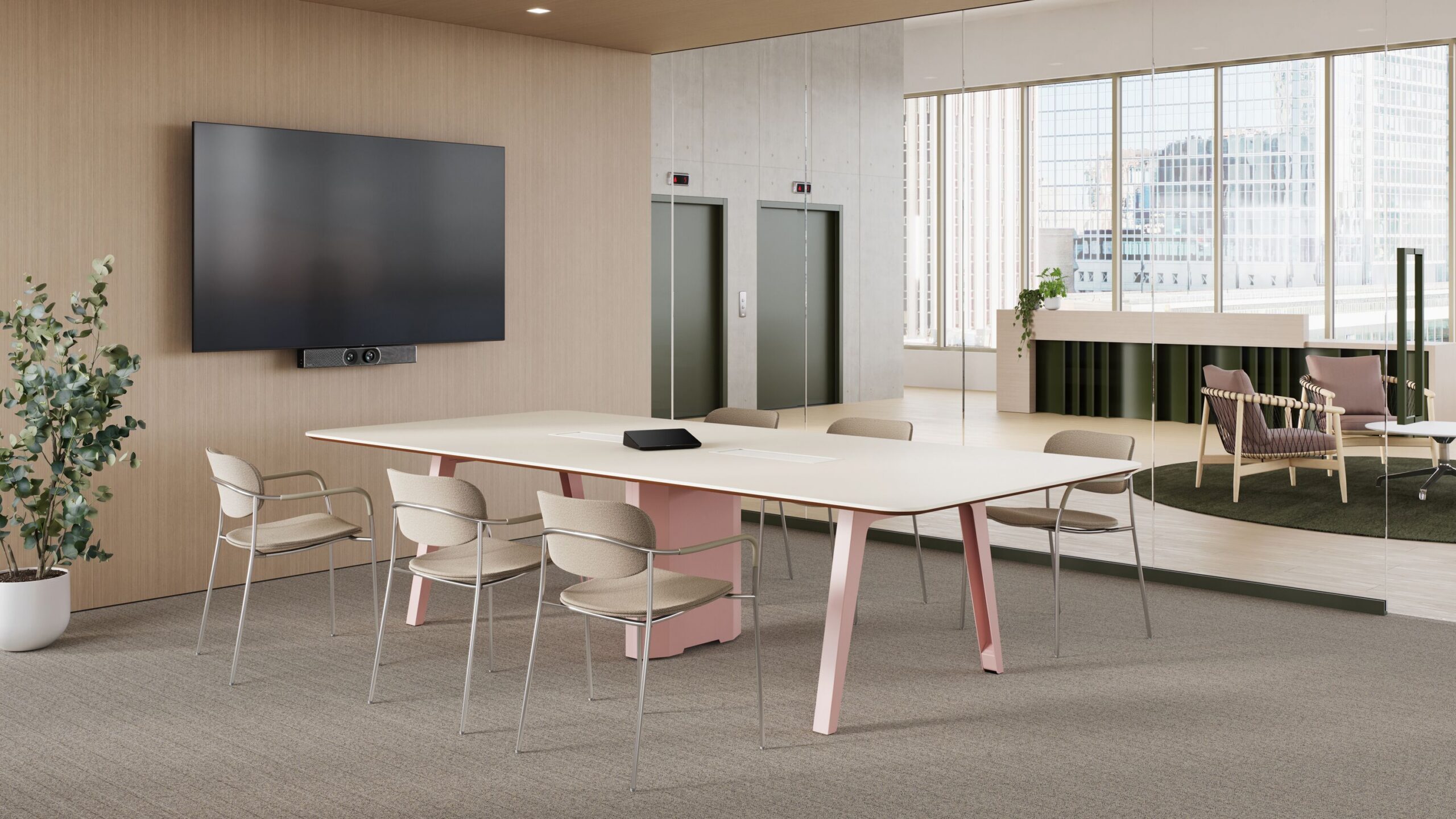
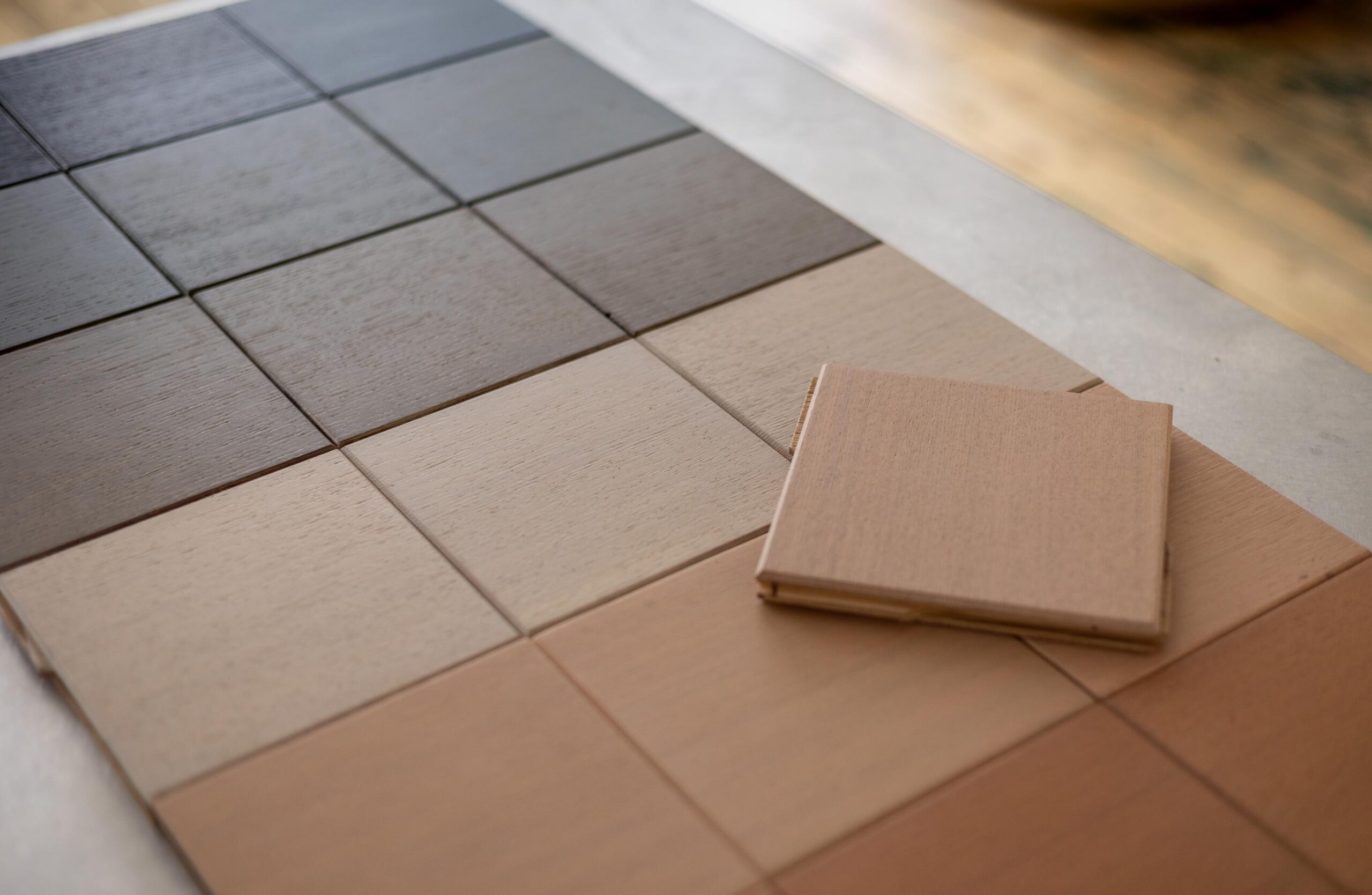
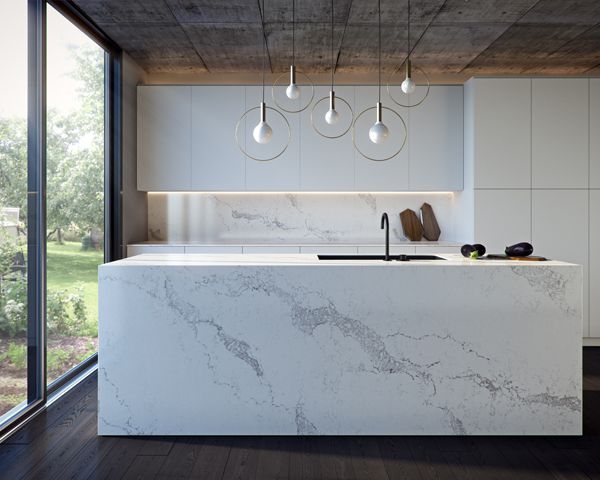
Its neutral colour scheme makes the Statuario Maximus a versatile choice for a wide range of projects – Dixon recommends pairing it with, “classic whites, warm neutrals through to grey kitchen cabinet door colours, as well as numerous wood species such as oak, walnut and equally with a more industrial colour palette”.
Caesarstone
caesarstone.com.au