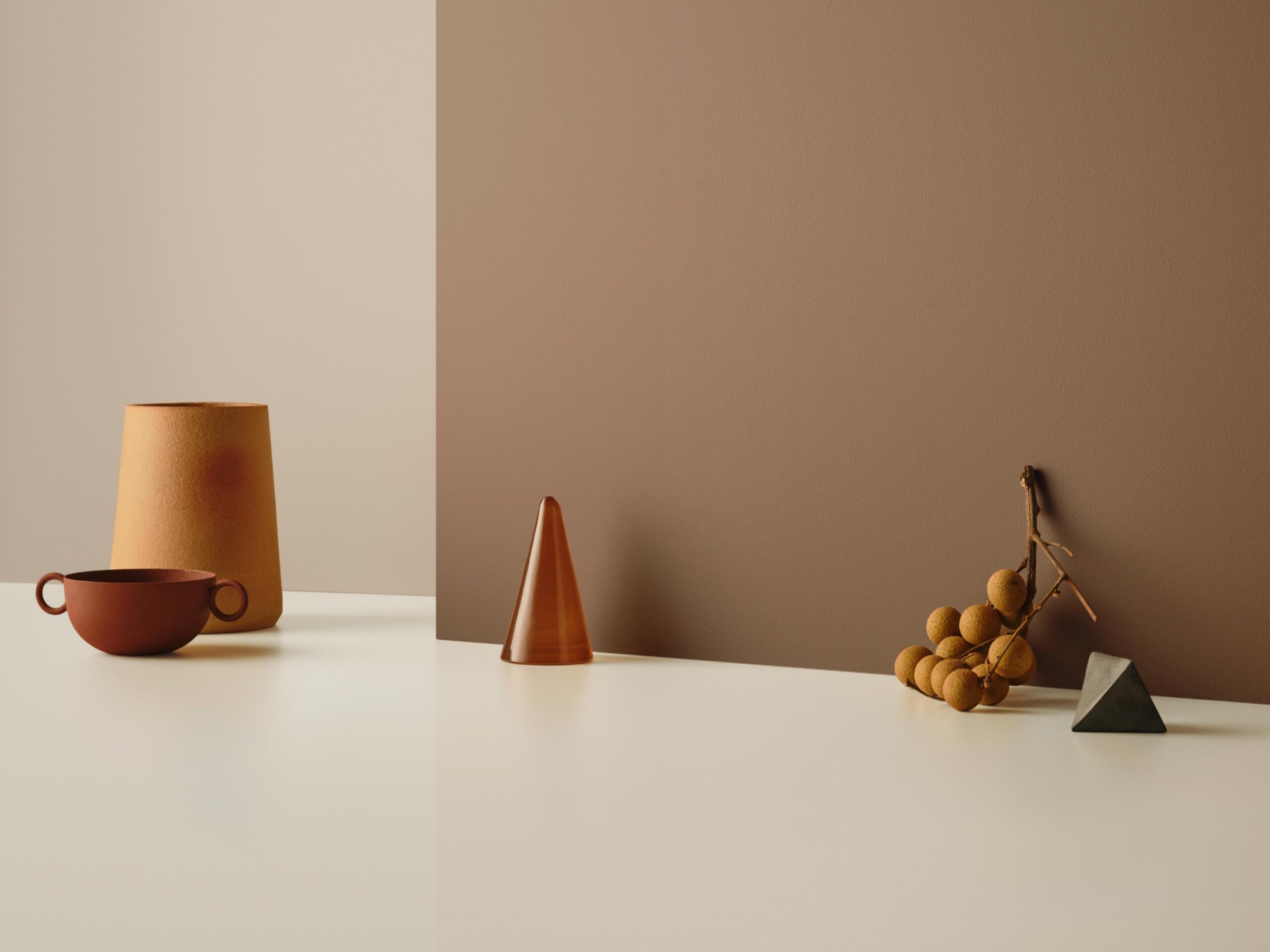
The sense of hope and gratitude felt by all in the wake of the pandemic has been encapsulated by Haymes Paint, which has just released its 16th Colour Library, titled Energy Shifts.
Haymes have released three new palettes, with an overarching theme to be ambitious with colour curation and selection. The company has deeply researched colour psychology, which has influenced the choices made across each palette, with each created to be versatile.
“We want to provide people with the tools to understand what’s happening in the world of colour,” says Haymes’ colour and concept manager, Wendy Rennie.

“People are determined to get it right now. Whatever we can do with colour and design to make an impact and make the ultimate space, it needs to be more than the aesthetic value. It has to go deeper than that.”
Light Play is the first of Haymes’ offerings for 2023. Based on the idea of using colours to inform creation, Light Play looks to assist in formulating a positive environment. There is an array of greens and blues, which are a reflection of people’s desire to connect with nature, as well as bright and fantastical shades with newer colours that offer depth and intimacy.

“The idea of Light Play is to be curious and to push boundaries,” says Rennie.
“I feel like the palette speaks more to a commercial setting, because I feel like they’re more inclined to make statements and create spaces where people will come and go from, which allows you to become more bold with colour.”
Related: Mika Utzon Popov’s breathtaking art rug

Carefully Nurtured, Haymes’ second offering, is a reflection of the colour psychology research undertaken by the company. There’s no white within the palette, which features two new colours created by Hames: Interplay 1, a lemon and yellow hybrid, and Adobe, which has an earthy, skin-like character which Rennie says pairs perfectly with natural linens.
“This palette for me is about harmony. It has a strong sense of calm that could work easily across both home and commercial settings.”

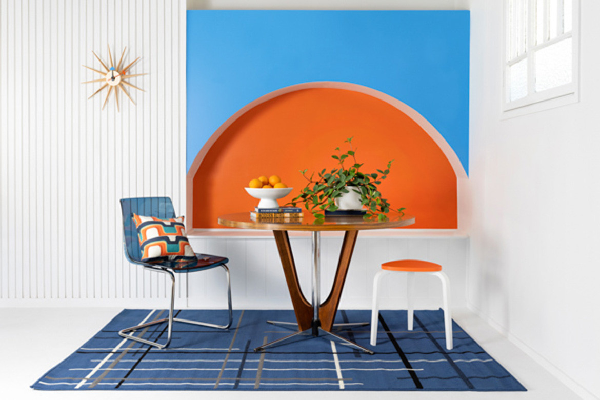
Live Wire is Haymes’ ode to the past. There is a real liveliness and sense of vitality to the palette which pairs colours from the 60s, 70s and 80s. White returns in this palette and serves as the base to render the other colours usable.
Blues, reds and greens are seen throughout, giving designers the ability to harness individuality and creativity. The bold colours in this palette, combined with the use of pattern, define it as diverse and assured, demonstrating that what is right for one is not necessarily right for all.
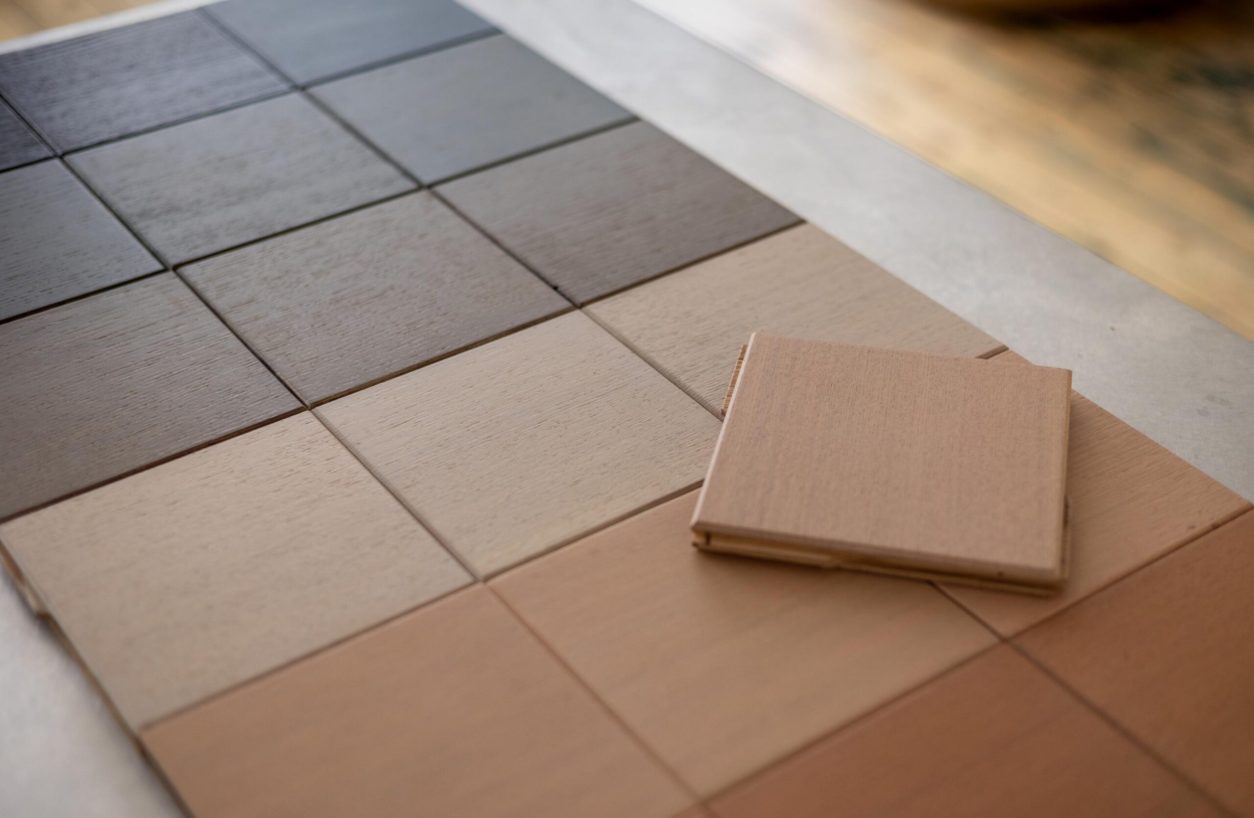
“We’ve actually done away with mini palettes in favour of numbered schemes to help people make decisions easier when it comes to interiors,” says Rennie.
“It’s about looking at briefs and outcomes and applying colours that make sense.”
Haymes’ Energy Shifts Colour Library
haymespaint.com.au
We think you might like this story about the colourful and art-led QT Newcastle by Nic Brunsdon and Associates.