The home of architecture and design in Asia-Pacific
Get the latest design news direct to your inbox!
Get the latest design news direct to your inbox!
A Brutalist 1970s library building provides the bones for a Renaissance-like redevelopment at Monash University’s Caulfield campus. The outcome is a dynamic hub that serves a complexity of 21st-century needs. “It was about opening the library up to the central village green of the campus and bringing light into the building,” says John Wardle Architects’ Jasmin Williamson.


You need only glimpse the most popular design blogs and Instagram accounts to know we’re smack-bang in the middle of a library renaissance. And if you have, chances are you’ve come across the mind-boggling Binhai Public Library by MVRDV or MKCA’s delightfully designed Children’s Library for transitional shelter in New York. So, you won’t need much convincing. Scale aside, both of these projects exemplify a typology facing unprecedented opportunities to rebrand its service offerings, whereby the physical environment has become the key tool through which to make this happen.
As far as academic libraries go, it wasn’t that long ago we thought online learning would completely take over from traditional on-campus learning, rendering the library superfluous. Technology has certainly become more deeply embedded in the student experience, but all this means is that there’s been a shift in the role of traditional learning environments. And libraries are no longer passive repositories of information. Instead they are dynamic hubs of collaboration that support autonomous and group learning while also fostering a sense of community. It’s no longer just about books.
So what are students’ current expectations of academic libraries? This is a question John Wardle Architects’ (JWA) senior associate Jasmin Williamson welcomed with interest when the Melbourne-based practice, which also has a studio in Sydney’s Surry Hills, began stakeholder engagement for the renovation and addition of Monash University’s Caulfield Library. “The resounding response from students was they wanted quiet dedicated places to study,” she recalls. “And so this directly informed our brief and the proportion and types of settings we created.”

The original library was built in 1972, a startling Brutalist building with seating capacity for 750 people, when the Caulfield campus was still part of the Chisholm Institute (a TAFE institute). Williamson and the team needed to significantly translate a program that was inevitably out of step with today’s pedagogies, diversifying study environments and doubling the seating capacity in the process. The new design had to also respond to its setting because the university was implementing a masterplan at the time. As a result, JWA’s alterations not only addressed the four-storey interior, they also dramatically transformed the exterior, lending the building a sense of legibility within its bustling context.
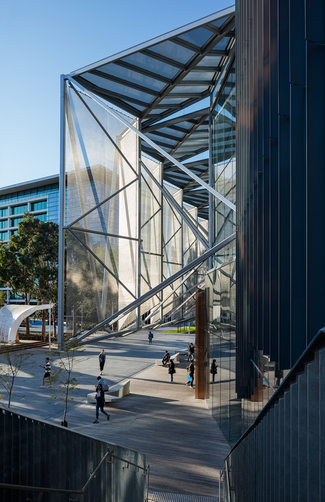
By positioning a west-facing single point of entry beneath a complex cantilevered truss system that supports a steel and mesh ‘shade house’, a new identity for the library was immediately created. As Williamson explains, “It was about opening the library up to the central village green of the campus and bringing light into the building. Behind the shade house, high-performing glass reveals the active workings of the library and also allows students’ long views through the delicate mesh screen.”
This shade house canopy denotes a zone for casual occupation too, with concrete and timber seating providing students with an informal place to meet or just sit quietly. And elsewhere on the building’s edges, the architects have modified the envelope to create new spaces for habitation; welcoming nooks that encourage students to want to hang out on campus. These spaces also work in with the promenades adjacent to the library and together offer generous circulation paths that previously didn’t exist. It adds to the building’s legibility and further opens up the glazed structure to passers-by.
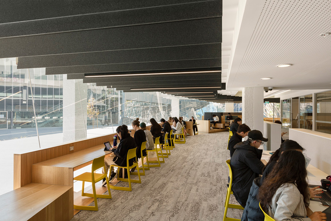
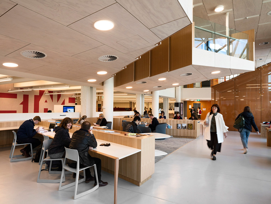
Once inside, students are greeted by a large text-based artwork, Give Or Take, by artist Rose Nolan, which immediately engages with its bright colours and strong message. Its seamless integration is to be commended and Williamson notes the commission wasn’t an afterthought, rather something that was pronounced very early on in the development stages. Making the entry experience even more inviting is an open plan that allows the entire floor, including the service zone, student lounge, café, collaborative study seats and meeting spaces, to be surveyed from this point.
The existing fit-out had been incrementally layered over time and the architects stripped everything back to reveal remarkable 19-metre span post tensioned concrete T beams – a unique structural solution for its time that allowed high load capacity bookshelves. The singular, repetitive nature of these beams are powerful and along with the existing spiral stair lend the scheme its most compelling expression.
“Our design response integrated these elements, revealing them and allowing them to function as counterpoint to the building’s south-western addition,” says Williamson. “It was really about touching the shell lightly and treating the interior fit-out as an installation.” A new void was precisely cut through the building to draw in light and the resulting central atrium is the anchor around which all the various study settings are positioned. Sightlines are maintained, while textural and tonal changes in the material palette are used to define the program, lending the design a sense of nuance.
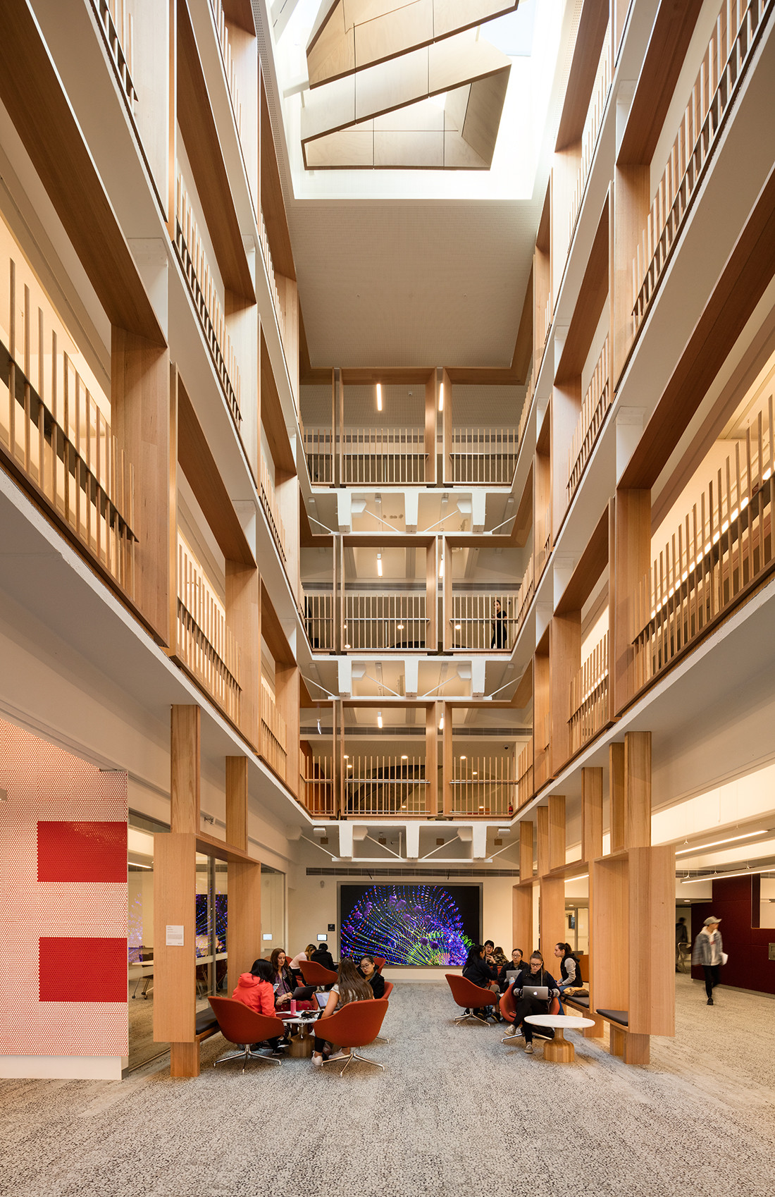
Although a number of study spaces cantilever over ground level, by far the most striking are the timber seating ‘portals’ grouped throughout the interior. The architects have displayed a fine attention to detail, not to mention wit and intelligence, by repeating the portals’ framework as a balustrade around the atrium.
Importantly, many seating settings are flexible to futureproof against changes in student needs. For a library that often functions at full capacity, it’s incredible how quiet it is. Williamson and the team have created an oasis of calm by championing openness and connectedness through a design that respects the past and looks forward to the future.
This article originally appeared in issue #77 of Indesign magazine – the ‘Knowledge Economy’ issue. See what products, finishes and furniture were specified in the Dissections here.
A searchable and comprehensive guide for specifying leading products and their suppliers
Keep up to date with the latest and greatest from our industry BFF's!
The internet never sleeps! Here's the stuff you might have missed