The home of architecture and design in Asia-Pacific
Get the latest design news direct to your inbox!
Get the latest design news direct to your inbox!
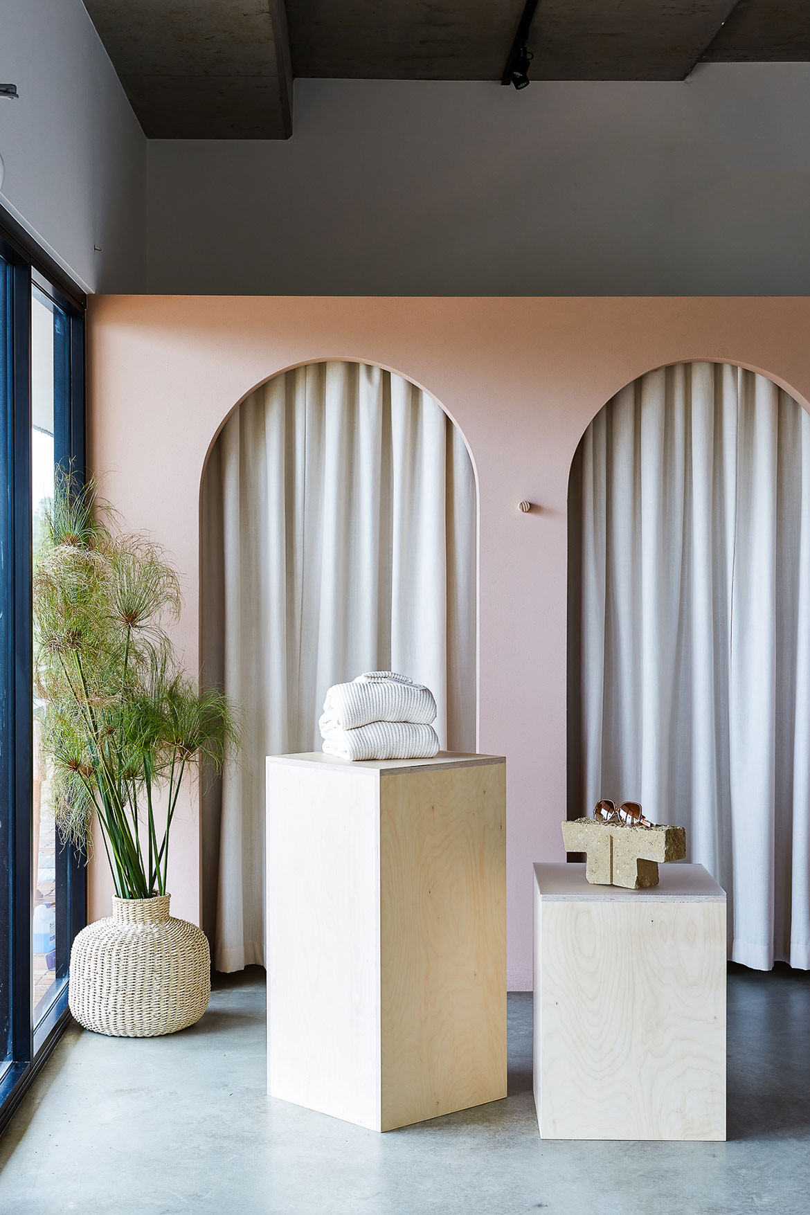
Nikkou – meaning sunshine in Japanese – is exactly what Australian retailer Nikkou Store delivers throughout its curvy, pink-washed concrete space.

April 26th, 2019
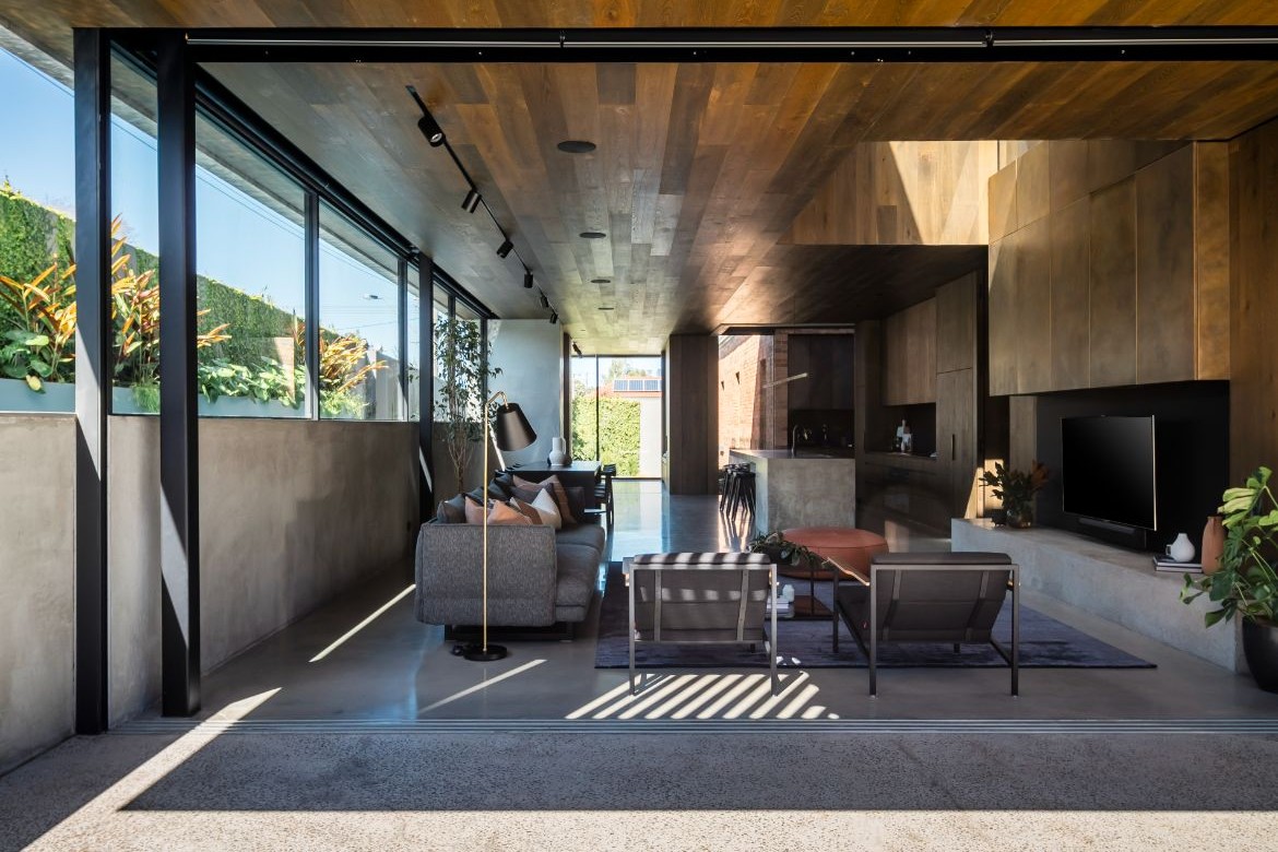
There is a great distance between Casuarina, a quiet coastal town on the Queensland-New South Wales border, and Japan – but it doesn’t feel so great inside Nikkou Store, a boutique fashion retailer that blends the breezy openness of coastal Australia with the quiet detailing of Japanese design.
When designer Vanessa Webber was approached by her old high school friend, Nikkou Store founder Tiffany Cooper, to design the space, the brief was as simple as the philosophy she wanted to instil within its walls. After travelling extensively in Japan, she decided on the name nikkou for her foray into retail. Meaning ‘sunlight’ in Japanese, this is exactly what she wanted to flow through every inch of the space, capitalising on the natural assets of the northern New South Wales coast.
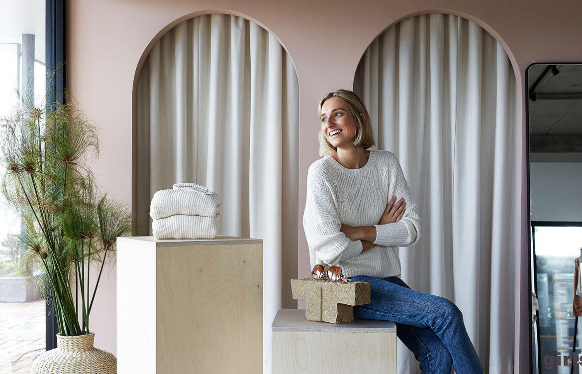
To Vanessa, this easily translated into an overarching casualness to the concept: big, soft curves, light and feminine colours, and an open invitation to the elements.
“To reflect the brief, in the details I used a lot of soft curves,” she says. “You can see that in the arches of the fitting rooms, the details of the joinery, and even in the storeroom. At first we’d drawn a square storeroom but then we were like, ‘Hang on, that doesn’t work. There can’t be any corners in here!”
But as with everything in life, a soft touch is brought into even starker contrast when juxtaposed against something harsh. In Nikkou Store, this necessary contrast comes in the form of the exposed concrete floor, the rough textural finishes, and the overall palette of hard materials.
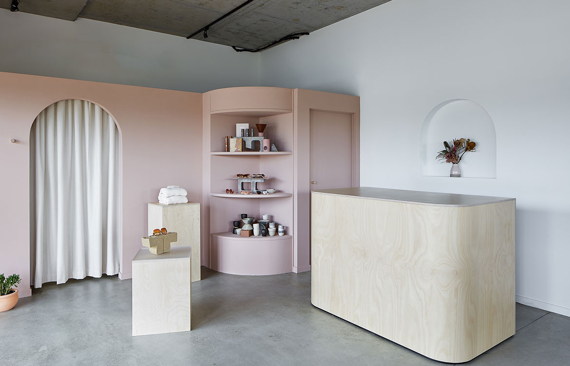
“To reflect the locality and to have an honesty of materiality we left the exposed concrete floor, which also meant we didn’t have to use any unnecessary or wasteful materials,” explains Vanessa. “The paintwork that we did was a feminine soft pink that we applied a textured finish to – it almost has a sandy finish to it. It’s created that juxtaposition with the soft fabric that’s displayed there.”
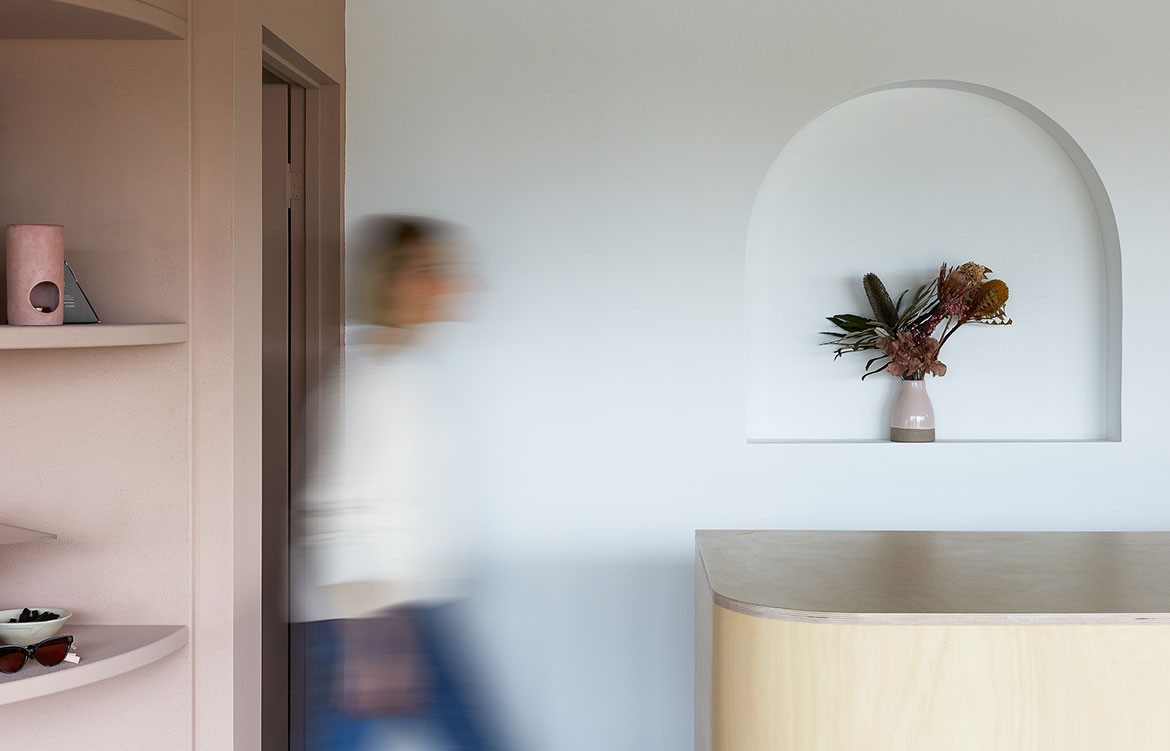
The most important finishes to the store are intangible ones – sunlight and wind, which are welcomed in through clever site planning and structural manipulations.
“I was initially given the floorplans and there was only one entry into the store,” says Vanessa. “But because Nikkou Store is on a corner location, I thought, ‘Why not have people walking through both entries?’ I added another door and [Tiffany] often leaves them both open so you’re getting this beautiful breeze through the space.
“We also lowered the wall to the fitting rooms because we wanted to get as much natural light as possible. Even when you’re in the fitting room, you’re still getting that natural light.”
Have a look through our retail design archives. And for a weekly dose of design, join our mailing list.
A searchable and comprehensive guide for specifying leading products and their suppliers
Keep up to date with the latest and greatest from our industry BFF's!
The internet never sleeps! Here's the stuff you might have missed