The home of architecture and design in the Asia-Pacific
Get the latest design news direct to your inbox!
Get the latest design news direct to your inbox!
A new headquarters for EMI Australia is the perfect embodiment of the company’s inner urban culture, writes Paul McGillick.
June 5th, 2012
The project to find and fit out a new headquarters for music company, EMI Australia, was very much driven by its Chairman, Mark Poston. Stuck in a building in Cremorne that everyone hated, but tied to a lease, there was plenty of time to search for a new location.
The building in Flinders Street, Surry Hills, came up on the radar very early and, despite looking at many other sites, Poston was convinced from the beginning that Flinders Street would make the ideal home for EMI.
The building brought with it quite a lot of history. This had effectively begun with a makeover by the legendary Burley Katon Halliday (BKH) for Space Furniture (later ECC and Gelosa occupied the building).
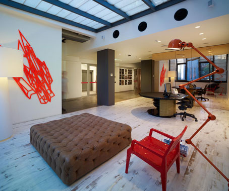
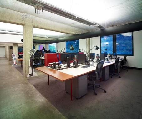
BKH had stripped the building back to its concrete shell, sandblasting the concrete back so that you could see the aggregate.
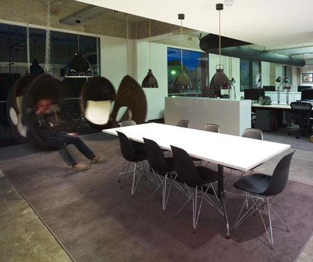
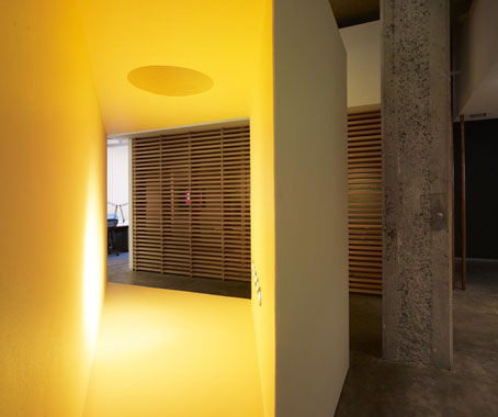
They had also installed two stairways which set up an intriguing spatial dynamic which Andrew Cliffe – Director of The World is Round, who were commissioned to design the fit-out for EMI – describes as a “kind of figure of eight” and which he was keen to exploit in order to generate a constantly interesting spatial experience with continuously emerging views and a feeling that everything and everyone was integrated into an exciting whole.
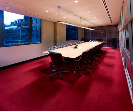
Determined to respect the original BKH makeover, Cliffe says, “There was a component there of making sure you didn’t wreck what was already there. It was important to figure out what not to do as much as what to do.
“The idea was not to fix anything into that slab that didn’t need to be there, to keep it as honest and raw and as clean as possible. Also making sure that we didn’t inhibit the flow of the space and to respect the light and the views.”
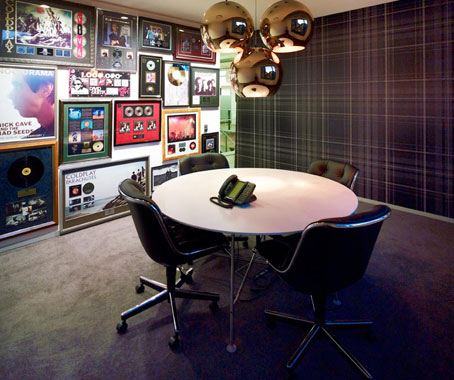
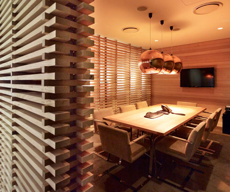
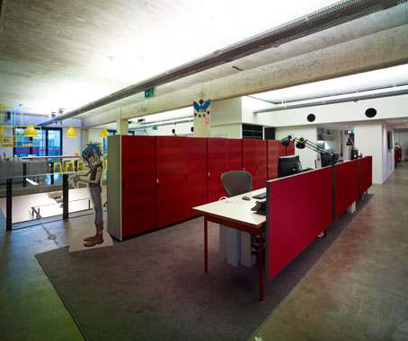
The brief required 10 enclosed offices, one for each department head. Otherwise, it was to be a free-flowing space.
The offices, for example, are pushed to the core, maximising natural light and views for people at workstations. Cliffe also made optimal use of the ’figure-of-eight’ to break up the open plan and create a variety of spaces – and surprises.
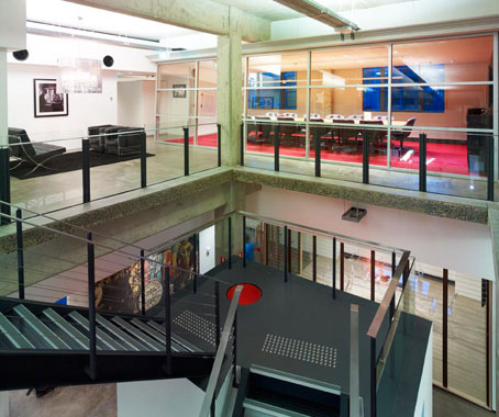
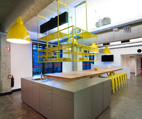
Hence, the space unfolds as a series of mixed intimate and more expansive spaces.
This is an excerpt from an article that appears in Indesign #49, available now.
Photography: Tyrone Branigan
The World Is Round
theworldisround.com.au
INDESIGN is on instagram
Follow @indesignlive
A searchable and comprehensive guide for specifying leading products and their suppliers
Keep up to date with the latest and greatest from our industry BFF's!
The internet never sleeps! Here's the stuff you might have missed