The home of architecture and design in Asia-Pacific
Get the latest design news direct to your inbox!
Get the latest design news direct to your inbox!
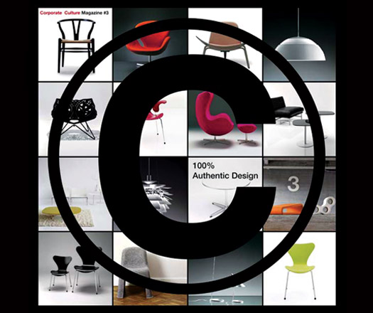
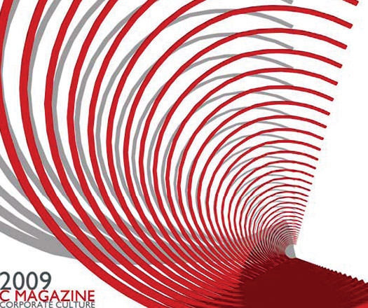
Issue 03 of Corporate Culture’s magazine invited designers to create covers displaying their understanding of the company.
July 29th, 2009
When Corporate Culture got to work on the latest issue of their bi-annual publication, C Magazine, they thought it a perfect opportunity to better understand how designers perceive the company.
“The C Magazine was released for our ten-year anniversary and we felt the market was missing a magazine that shared stories of overseas and local designers,” says Richard Munao – Managing Director Corporate Culture.
For the latest issue it was decided they would hold a ‘cover competition’ asking designers to put forward designs employing the iconic C motif of previous issues.
“We believe in nurturing Australian Design and this was another way for us to invest in what we believe in,” Munao says.
The competition received entries from across the country, with creative responses exploring Corporate Culture’s furniture design icons, their dedication to emerging Australian design and their commitment to authentic design.
“I was truly impressed with the number of quality entries we received and the amount of effort that people went to,” Munao says. “I was also very happy that all of them could have been on the front cover of the magazine, a true reflection of the quality of designers we have in our own backyard.”
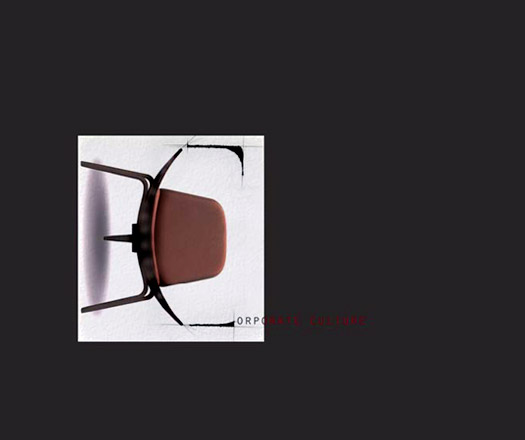
The winning cover by Carr Design Group features the ELFIN stool by Australian designer Ross Didier. “I think the final cover truly underpins our support for local design and has an element that will surprise you and I think we love to do the unexpected,” Munao explains.
Issue 03 of C Magazine introduces Swedish furniture company, OFFECCT, meets Melbourne-based designer Lisa Vincitorio, explores the evolution of the Design Journey competition and other great profiles and features.
Issue 03 will be available from the Corporate Culture Showroom in Chippendale for Saturday in Design 09, make sure you get along to pick up your own copy.
See all the fantastic entries below.
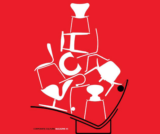
Carr Design Group
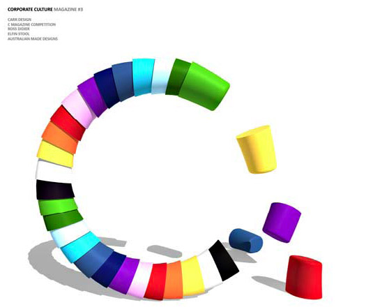
“The design Philosophy is to emphasise the iconic furniture pieces that are synonymous with the Corporate Culture brand.
“As specialists in creating space and representing objects in the third dimension, we developed this concept by using our skills to illustrate a comic notion of the renowned Fritz Hansen Series 7 chair in action.
“However, in a time when our economy and community requires support, it is our responsibility to represent Australian design on an international level”

Corporate Culture application button.
“iPhone represents the latest in technologically sophisticated, beautifully-designed, user-friendly communications and lifestyle accessories.
“An application button with its simple graphic format is the entrance to the most up-to-date information. This design questions how long before this magazine is a simple touch of a button on your portable handset?”
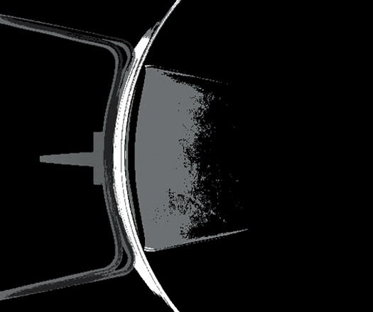
Donovan Hill
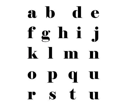
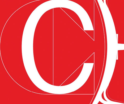
“The idea behind the cover is that negative space can be more powerful than full a space. By illuminating the letter “C” from the alphabet the viewer fills the missing letter mentally.
“By undertaking this process the viewer momentarily concentrates harder on the missing letter therefore making it more significant than the instant visual recognition.”
Geyer
“My design is best suited as as the magazine front cover as Corporate Culture embraces so many iconic chair designs that they all must simply be shown on the front cover to remind us and celebrate some of the fabulous designs.”
Geyer

Doing More with Less
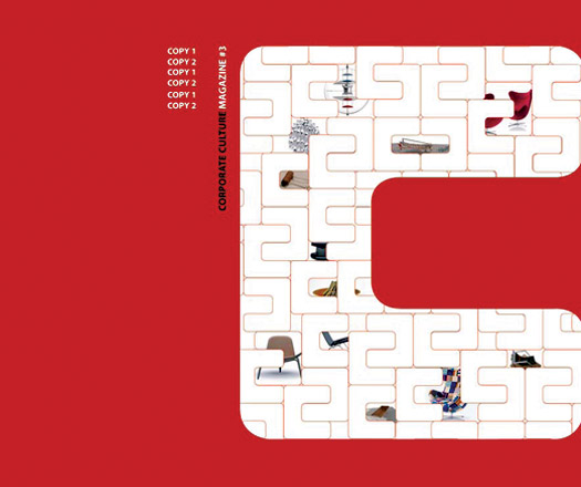
“The design reflects the classic and iconic nature of the products Corporate Culture offers and the impact that a single item can have. The ’C’ is designed to border the edge, directing the eye whilst maintaining a solid stance in the mind.”
Cottee Parker Architects Pty Ltd
‘1963, 1997 and today’
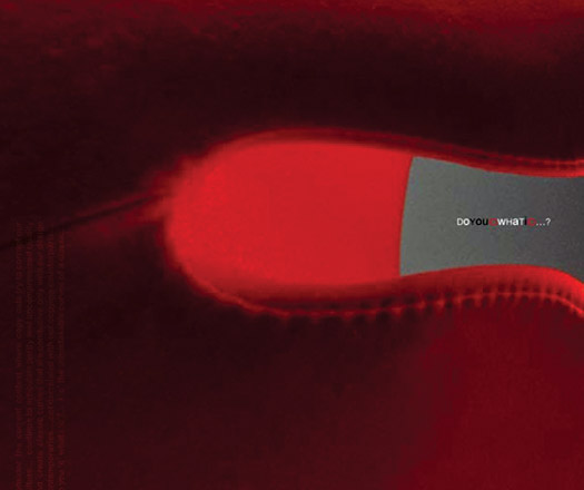
Commission It – Don’t Copy It
This biannual C Magazine cover identifies Corporate Culture as a promoter and retailer of 100% authentic design. Fuelled by the proliferation of style conscious consumers and corporations design theft has reached an all-time high.
The letter ‘c’ has been incorporated into the design through a universally recognised copyright symbol. This cover aims to promote the purchasing of genuine and authentic design pieces and the existence of companies like ACID (Anti Copying in Design).
Hard-hitting action groups committed to fighting intellectual property (IP) theft and the promotion of IP as a positive commercial force. ACID is a much-needed movement that lobbies against the plagiarism of ‘high design’ chairs and furniture and intellectual property theft. The aim… Fight the imitators. The slogan… Commission it – don’t copy it.
… An important message for not only designers but consumers alike… Coporate Culture embodies authenticity and honesty in craftsmanship… it’s a culture within itself.
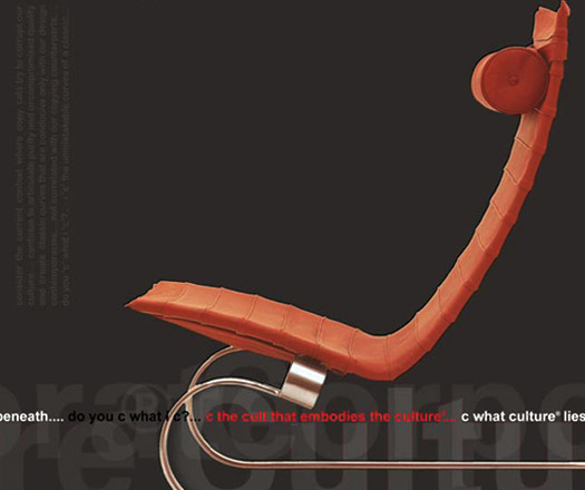
“Each submission is based around present issues of retaining and acknowledging the origins of classic design in an economic climate which challenges the cost of a copy against the purity and desire to own and experience the curves of a classic original… Each submission explores the detail form of furniture pieces from 3 different Corporate Culture design icons.”
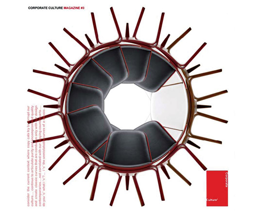
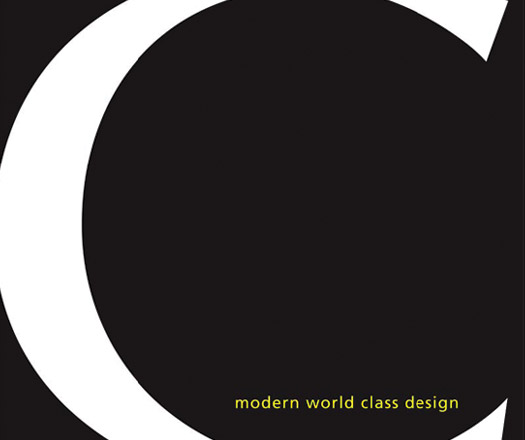
“This cover design shows a legacy of distinguished furniture pieces. Despite being reduced down to the most elemental of linework every silhouette is still instantly recognizable, showing how iconic these designs have become.
“The letter C fits effortlessly within this structure, illustrating how Corporate Culture not only supports these timeless pieces but has become a classic in itself.”
Falinc
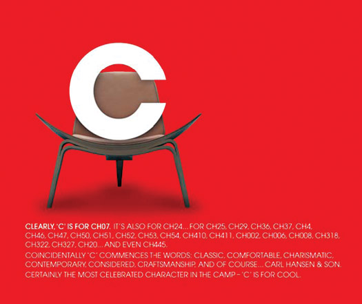
‘C’ is for Clever
The rationale is to use the cover competition to further promote the CH07, and to raise awareness of the rest of Carl Hansen & Son collection available from Coporate Culture.
The ‘C’ words describe not only the CH collection, but the highlight values of Corporate Culture – promoting the Corporate Culture brand.
The tone is clever, cheeky and cool. The clean look complements the previous cover issues, and incorporates the Corporate Culture colour palette.
BVN Architecture
Design philosophy – Less Is More
futurespace
“The Corporate Culture ‘C’ represents the way Corporate Culture supports, cultivates, and promotes original and authentic design, on a local and international stage.This is why the ‘C’ on the magazine cover is shown as the ‘backbone’, or support, of a classic design piece. The ‘C’ illustrates our knowledge that Corporate Culture will deliver us the best and most innovative of Australian, and
International Design.”
Crisanne Fox Designs
“Inspired by the 50th Anniversary of the Egg Chair by Arne Jacobsen, I have created a ‘C’ which reflects the back curve of the chair itself, and then multiplied this form (as eggs are a symbol of life multiplication) so it literally jumps out of the page and creates a dramatic, yet sophisticated effect.”
“We can C what you C – My concept attempts to show that Corporate Culture proactively seeks new Australian Designers, finding hidden talent through local competitions and design workshops as well as bringing classic and contemporary design from around the world under the one umbrella.”
Cachet,
Catalogue,
Celebrate,
Celestial,
Centerpiece,
Character,
Clarity,
Classic,
Collection,
Colour,
Comfort,
Configuration,
Contemporary,
Contrast,
Corporate,
Culture.
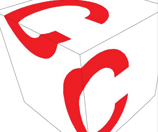
“The interior spaces, which surround us – living, working and retail spaces – are typically bound by the arrangement of the more 2-dimensional surfaces of floor, walls and ceiling.
“What defines, however, the character of these spaces the most, is expressed by the very 3-dimensional fit out, with our individual choice of furniture and objects. In very simple and obvious terms this is reflected by the cubical layout of the Corporate Culture C’s for the magazines front cover.”
Comments: Simplicity
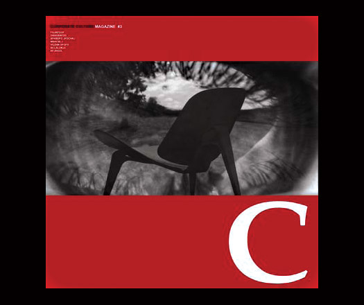
“The idea behind this design is that when you visit corporate culture you “See Culture”, you see the history of living culture through the icons of design.
“This cover shows, through the reflection of the viewers eye, the CHO7 chair sitting in the landscape of a beautiful garden. It is a somewhat surreal image, almost dream like. It invites imagination and has a timeless quality like the products stocked by CC.”
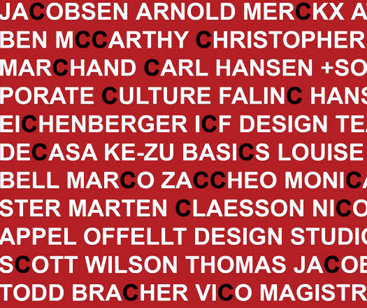
“This cover design uses the names of only the designers that Corporate Culture stock that have a C in their name. The C Club effectively! It makes a grapic pattern out of this simple idea.”
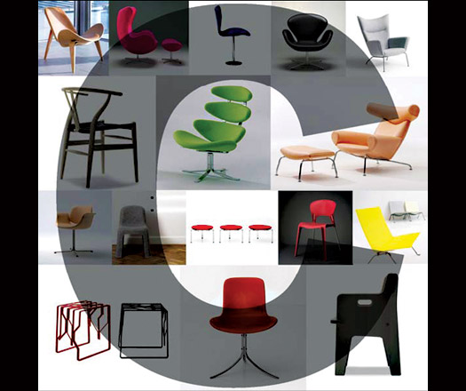
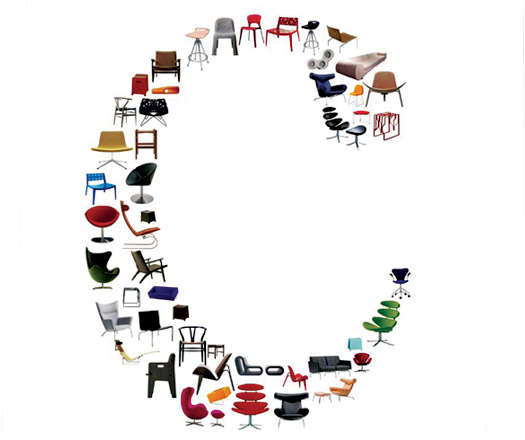
“My submission examines historical examples alongside contemporary designs. A dynamic interior
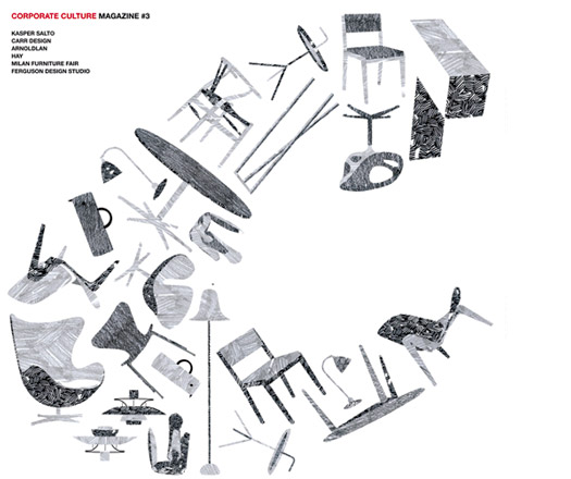
collage.
“By representing iconic pieces from Corporate Culture’s collection in a dramatic arrangement, a senseof-
play emerges to engage the viewer in their forms.
“The overall letterform “C” aims to compliment the preceding covers. It emerges as an appropriate
progression in the magazine’s design.
“It is a celebration.”
A searchable and comprehensive guide for specifying leading products and their suppliers
Keep up to date with the latest and greatest from our industry BFF's!
The internet never sleeps! Here's the stuff you might have missed